This is a bit of a magical mystery tour video. It starts off with a crumb of curiosity about the size of Antarctica in my children’s First Atlas and heads off in a few different directions, including Nigeria and an episode of the The West Wing from 12 years ago.
Little did I know when I first threw the question out on Telegram about how different the world map is looking (Was Antarctica always that big?) that I’d end up catching Michael Palin in Nigeria introducing a rejigged world map to a class of bemused school children, while flicking through the channels on the TV.
What are the chances?
Did I miss the memo? Is everyone else aware of this new world map?
Turns out most maps are distorted. The Mercator Projection is what Google Maps uses, looks like a flat earth map to me. Apparently it's racist though. Fosters imperialist dominance from colonial times, allegedly. The map Michael Palin showed the kids in Nigeria is the Gall Peters Projection which is an equal area map and stretches certain countries. There are loads of different projections apparently, none of them right. I wonder. One of them must be the right one.
Nigeria (now bigger and better according to the new map) is top of the pecking order for asylum seekers entering Ireland in 2024 and their claims have been given priority under a new policy, so the Michael Palin show appearing on our TVs is no coincidence. As Official Ireland trips over itself to accommodate an ever increasing number of Nigerians, this is the picture in the African country of more than 218 million people and growing.
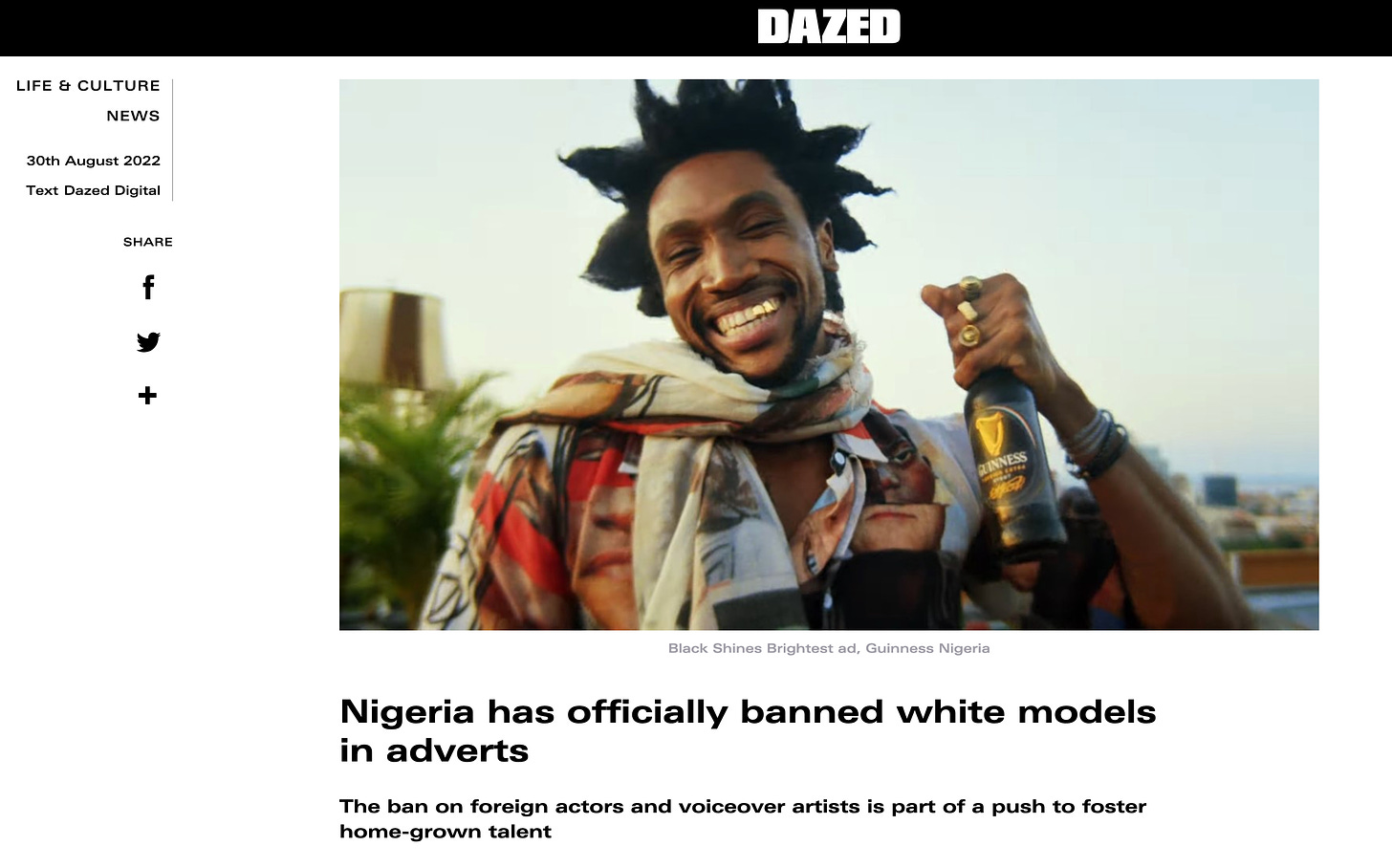
Already, the British agency AMV BBDO has shot an African campaign for Guinness, “Black Shines Brightest”, in Lagos with a Nigerian director and local models, reflecting the shift in the nation’s advertising industry.
As Palin points out in his documentary, Nigeria’s population is exploding. The average woman has five babies while in Ireland birth rates have dropped by as much as 20% in the last decade.
So why is tiny Ireland rushing to accommodate an uncapped number of people from a country we barely know, apart from Palin’s doco?
Surely there’s plenty of space on their home turf, as the new map tell us. As ever the death count in Ireland’s native population goes by unchecked in the mainstream media as our overall population increases with newcomers, people with zero connection to the land apart from our social welfare offices. Excess deaths since the rollout of the trial vaccines now stands at 18,800 according to Irelandexcessdeaths.com. We’re supposed to overlook that in our enthusiasm for ‘inclusiveness and diversity’.
On a side note, Professor Luke O’Neill in his children’s book Show Me The Science predicts Antarctica will become a destination for migrants in the not so distant future. What does he know? Remember there are loads of clues in children’s books if you’re willing to explore for hidden nuggets and info hidden in plain sight.
In that clip of The West Wing from 12 years ago it ends with the hemispheres being flipped for social justice reasons. At this stage, nothing would surprise me. Thing are that nutty.
Anything could happen next.


Share this post